Whilst my son was having his weekly swimming lesson I went for a mad dash around Duns Castle and Hen Poo whilst it was still light.
As I cleared the darkening woodland and came around onto the path by the lake, the swirling mottled clouds above looked like something from a water colour painting.
The sun had disappeared below the tree line to the west and the sky varied in colour and light intensity from shimmering cream to silvery blue and dark gun metal grey.
Allanton Inn, Allanton The Allanton Inn is a historic coaching inn located in the peaceful conservation village of Allanton (between Duns and Berwick-upon-Tweed) in rural Berwickshire. The inn offers a warm, relaxing, family-friendly atmosphere for those wanting a drink at the bar, a meal made from delicious local produce, or an overnight stay in the lovely Borders countryside.
Having seen sample menus and read the clients copy detailing all the local produce and seasonal ingredients, it was clear that exceptional food and a charming friendly welcome were key sales points. I was keen to factor these elements into the new site design, along with photos, awards, a map and a responsive layout (to ensure that the site could be viewed on desktops, tablets and smart phones alike).
I selected a calm colour scheme that complemented the interior photos of the inn, a web font that tied in with the old sign that hangs above the door, and integrated a photo based slide show to highlight the best qualities of the accommodation. The reservation number, awards and promotions relating to online booking were all positioned in prominent locations, and each page features a carefully designed blackboard menu (but in this instance, instead of listing dishes, there are links to each of the Allanton Inn’s menus, to help get visitors salivating).
Along with information about interesting local attractions, easy to follow directions and a huge volume of glowing testimonials, I hope the charming nature of the inn spills onto each page of the website.
Client feedback? “Thanks very much, it looks great.”
Maden Eco, Berwick Scottish Borders Website Design were delighted to be asked to design and build the new Maden Eco website. The dedicated server that hosts our websites is powered by 100% renewable energy from wind turbines, and 75% of the electricity used in our office comes from our very own solar panels. Despite our own green credentials, a quick meeting at the purpose built Maden Eco office in Berwick showed just how much more can be achieved from sustainable renewable technologies.
Ultimately, that was the drive behind the requirements of the new website too; to highlight the broad range of renewable energy products that Maden Eco design, install and maintain for domestic, commercial and agricultural customers across the north of England and throughout Scotland. Solar panels for houses or factories, wind turbines for land owners or businesses, biomass heating solutions for individual homes or entire estates, and construction and renovation services all needed to be promoted.
With the rapid advance in green energy solutions, the choice of products on the market, and the evolution of the energy sector in general, it was clear that the website also required full content management software (to help Maden Eco keep their content up to date) as well as a flexible structure to allow for new promotional activity in the future as new green technologies emerged and existing solutions matured.
Working with staff at Maden Eco a site structure was discussed and arranged to help highlight core elements of the business. A clean, no-nonsense design was required and the finished site reflects this desire for clarity and ease of use. In order to allow Maden Eco to keep the site up to date it was also built around a leading content management system.
Several months of hard work on the part of both parties, a little client training in content management, and the site was ready to launch. Client feedback, short and sweet: “The website looks fab!”
AET Installations, Duns Logo designs are often split between those that just use a unique font and/or background colour, and those that also feature some sort of graphical icon. When used within logo design, an icon can either be a generic shape (something utterly unique that helps the viewer of the logo quickly identify and remember the brand), or it can visually summarise the main function of the business (and again, this helps with quick identification, but it can also explain the nature of the business without the observer needing to think).
AET Installations requested that Scottish Borders Website Design create a logo to represent their new grain drying business for farmers in the south of Scotland and the north of England. The brief was for a modern sans serif font, with an icon and three colours; green, yellow and blue.
Unfortunately, by their very nature, grain drying systems (which occupy an entire barn) don’t particularly lend themselves to being easily illustrated, especially not in a small and quickly identifiable three colour icon. Despite this, the style, colour and shape of the icon were taken from one of the elements used within the grain drying process; the fan. So in this instance, the icon may appear to be a generic shape to some, but to those in the industry, it will be seen as a stylised fan blade that visually ties the core business into the AET Installations logo.
Since the end of the hot weather we’ve had thunder storms passing by quite regularly. This evening a storm was tracking west to east along the Tweed Valley, with warm clear skies being swallowed by a dark, sinister, swirling cloud. As the cloud approached the thunder and lightning intensified, the breeze picked up, the temperature dropped and a sheer wall of rain could be seen behind the cloud to the west. I had noticed that the cloud was beginning to spiral and lower, and just before I started filming what looked like a tornado spout began to form and lower towards the rolling fields over the Merse. The video doesn’t really show the enormity of the dark, spiralling cloud mass that sat almost directly over the top of Cothill (just to the south west of Duns, Berwickshire). I experienced a bizarre mix of wonder and terror when recording the twister trying to form – it would have been amazing to actually see a full tornado in Berwickshire, but as the storm seemed to be moving toward the north I was terrified that if it did touch down Cothill might take a direct hit! Just after I stopped filming the spout seemed to tear itself apart and the cloud drifted harmless by. Not something that I ever expected to see in my lifetime – a tornado forming in Scotland!
Little Popsicles, Duns Little Popsicles, based in Duns, is a new venture that makes bespoke hand painted wooden gifts. Scottish Borders Website Design were tasked to design a new logo based on an initial idea developed by the client.
With some designs for logos it’s possible to go down different creative paths, but with a company name like “Little Popsicles” and the type of unique hand made gifts they produce, it was essential to create a logo design that visually tied the company name and products together.
The new logo, which features different tones of brown, bright green and pink, makes use of a font that’s fun, quirky and playful, as well as an illustration of some old fashioned lollipops. The colour, font and illustration combine to make a logo that’s new with a hint of the traditional as well as being professional but human and warm.
There was only one problem with the logo concepts for this client; too much choice! Their verdict: “They look great… good work. Very pleased!”
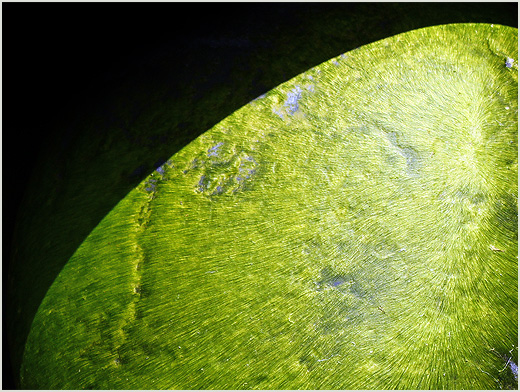
I popped to the coast at the weekend and whilst walking I came across an area of large round boulders covered in silky smooth seaweed that was so vivid it was almost luminescent (and also bone jarringly slippery to stand on). With the midsummer’s sun directly overhead, the harsh shadows cast by neighbouring boulders made for a stark contrast between the bright green of the seaweed and the near black of the shade. I took quite a few shots but opted to put this one on the blog as I love gentle curve that falls around the edge of the boulder, with dark shadow one side and the crisp green lines of the seaweed on the other.
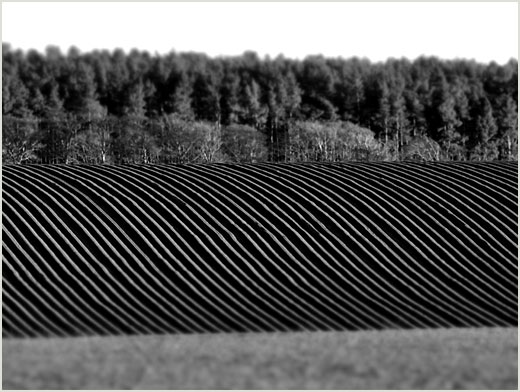
I have just upgraded my camera, and whilst experimenting with a new lens and filters, the setting sun cast its last rays of light across a newly ploughed field on the not too distant Merse. The perfectly straight and deeply shadowed plough lines accentuated the smooth curve of the hill, and in black and white the vivid markings look quite mesmerising; like a screw thread cutting through the landscape.
This wasn’t the scene that I expected to see from the window in late March. A thick layer of frozen snow blanketing the fields of the Merse, punctuated by dark bales of uncollected hay and ominously low moody clouds closing in on the only light of the day. It still feels like the middle of winter, rather than the dawn of spring.
I went for a walk around Hen Poo at the weekend and managed to capture a photo of the pond in Castle Wood. Traditionally photos of reflections have bright skies and dark hills mirrored by a pond or lake. This scene captured my imagination as it almost appeared as a negative. Instead of light skies the background the trees were almost black in the long winter shadows, with the delicately frosted reeds vivid white in comparison.