Rosie Sugden blog design

Rosie Sugden blog design

Rosie Sugden, Edinburgh
I read an article recently that stated that internet users are now sending over 200 million emails, making nearly two and half million Facebook posts and uploading 72 hours of YouTube videos every minute. An entire years worth of video is uploaded to YouTube every day. Factor in the Google Panda update (which demands original and fascinating content from websites), and it’s not surprising that more website owners want to be able to expand their content more easily, not to mention wanting to try alternative ways to reach potential new customers.

Full on content management isn’t for everyone. Nor is social media marketing. However, an integrated blog, or a blog set up alongside an existing website, is often a very useful way to allow website owners to become more involved in content marketing.

I designed Rosie’s logo and website back in 2011 in order to allow her to start promoting her new Scottish cashmere fashion label. Following some recent conversations about the changing landscape of online search, she asked me to set up and style a blog to sit alongside her existing shop. Her website (shown below) was to be updated with some stylistic changes, and the blog (above) was set up to allow her to expand upon website content and showcase behind the scenes photos, news and stories relating to her business.

Rosie’s feedback? “I really love it, I am so pleased with it. Thanks so much!”

Rosie Sugden website update

Allanton Inn responsive website design

Allanton Inn responsive website design

Allanton Inn, Allanton
The Allanton Inn is a historic coaching inn located in the peaceful conservation village of Allanton (between Duns and Berwick-upon-Tweed) in rural Berwickshire. The inn offers a warm, relaxing, family-friendly atmosphere for those wanting a drink at the bar, a meal made from delicious local produce, or an overnight stay in the lovely Borders countryside.

Having seen sample menus and read the clients copy detailing all the local produce and seasonal ingredients, it was clear that exceptional food and a charming friendly welcome were key sales points. I was keen to factor these elements into the new site design, along with photos, awards, a map and a responsive layout (to ensure that the site could be viewed on desktops, tablets and smart phones alike).

I selected a calm colour scheme that complemented the interior photos of the inn, a web font that tied in with the old sign that hangs above the door, and integrated a photo based slide show to highlight the best qualities of the accommodation. The reservation number, awards and promotions relating to online booking were all positioned in prominent locations, and each page features a carefully designed blackboard menu (but in this instance, instead of listing dishes, there are links to each of the Allanton Inn’s menus, to help get visitors salivating).

Along with information about interesting local attractions, easy to follow directions and a huge volume of glowing testimonials, I hope the charming nature of the inn spills onto each page of the website.

Client feedback? “Thanks very much, it looks great.”

Maden Eco responsive website design

Maden Eco website design

Maden Eco, Berwick
Scottish Borders Website Design were delighted to be asked to design and build the new Maden Eco website. The dedicated server that hosts our websites is powered by 100% renewable energy from wind turbines, and 75% of the electricity used in our office comes from our very own solar panels. Despite our own green credentials, a quick meeting at the purpose built Maden Eco office in Berwick showed just how much more can be achieved from sustainable renewable technologies.

Ultimately, that was the drive behind the requirements of the new website too; to highlight the broad range of renewable energy products that Maden Eco design, install and maintain for domestic, commercial and agricultural customers across the north of England and throughout Scotland. Solar panels for houses or factories, wind turbines for land owners or businesses, biomass heating solutions for individual homes or entire estates, and construction and renovation services all needed to be promoted.

With the rapid advance in green energy solutions, the choice of products on the market, and the evolution of the energy sector in general, it was clear that the website also required full content management software (to help Maden Eco keep their content up to date) as well as a flexible structure to allow for new promotional activity in the future as new green technologies emerged and existing solutions matured.

Working with staff at Maden Eco a site structure was discussed and arranged to help highlight core elements of the business. A clean, no-nonsense design was required and the finished site reflects this desire for clarity and ease of use. In order to allow Maden Eco to keep the site up to date it was also built around a leading content management system.

Several months of hard work on the part of both parties, a little client training in content management, and the site was ready to launch. Client feedback, short and sweet: “The website looks fab!”

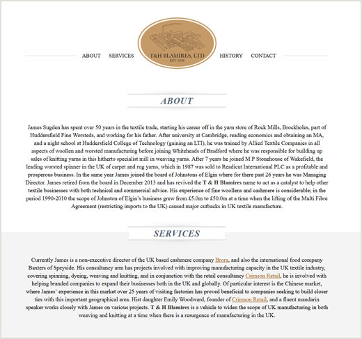
T&H Blamires responsive website design

T&H Blamires responsive website design

T&H Blamires, St. Boswells
T&H Blamires is an historic name in the world of textiles, and Scottish Borders Website Design were delighted to be a part of the responsive site design for the newly revived business name.

What appears to be a simple one page website features a responsive layout that automatically adjusts the content width and menu formatting to best fit desktop monitors, tablets and smart phones (on the latter of which, the menu switches to a simple drop down to aid speedy surfing).

The responsive site design also makes use of smooth scrolling navigational elements, with a click on the menu resulting in the page auto scrolling to the relevant section of content (and when content is viewed below the fold, a “Back to top” button automatically fades into view).

Customer feedback: “Looks great to me. Many thanks!”; short but sweet.

Exclusively Scottish website design

Exclusively Scottish website design

Exclusively Scottish, Gordon
When Exclusively Scottish approached Scottish Borders Website Design they already had a website promoting their fieldsports agency, but they needed some advice and guidance with regards online marketing, as well as getting the most out of the different aspects of the business.

Although a lot of the project requirements revolved around a more organised and optimised online presence (that would help direct traffic, leads and sales more effectively), quite a bit of creative design work was required to clarify the different aspects of the business.

Some of the content was thinned out from the existing fieldsports agency site. Scottish Borders Website Design then set up and branded a new blog to help promote news that related to all aspects of the business:

Exclusively Scottish Fieldsports Blog

In addition to the promotional blog, Scottish Borders Website Design set up and branded a separate online shop to help promote and sell the wide range of luxury tweed products that Exclusively Scottish sell:

Exclusively Scottish Online Shop

Lastly, a new holding page was designed (featured at the top of the post) to help direct users to the most relevant website or service. All the websites within the Exclusively Scottish group now have a consistent style, a specific purpose and tailored optimisation. Each site serves a different purpose, but it also effectively promotes all other related services, products and news in a professional, uniform manner.

Feedback from the client: “Thanks for everything – site and shop look great!”

The Wildlife Partnership website design

The Wildlife Partnership website design

The Wildlife Partnership, West Linton
Scottish Borders Website Design recently launched the new brochure website for The Wildlife Partnership; a company based in West Linton that provides a broad range of ecology services.

At the outset of the project The Wildlife Partnership advised that they had never been able to find their previous site in any search results. A quick bit of research revealed the reason: the previous web designer had placed the entire website within a hidden frame-set. This made the site look like it was tied to the domain name, but the site was actually located at a completely separate address on a BT server. As a consequence The Wildlife Partnership website had no connection to the actual domain name (and therefore wasn’t showing up in results).

The new website was designed around the company logo, colour scheme, content and marketing requirements, but most importantly, when the site launched it made use of effective hosting and the domain name DNS settings were correctly updated. End result? All search engines can now see, and have subsequently indexed all the site pages. Comments from the client: “Thanks for all your work. It’s been good working with you.”

Castle Gunmakers website design

Castle Gunmakers website design

Castle Gunmakers, Norham
Castle Gunmakers was formed in 2008 just over the border in Norham, Northumberland. They’d had a basic website for a number of years but contacted Scottish Borders Website Design with a brief that set out the need for a professional new website with more targeted content and ongoing online marketing support. With a business such as this, it was important to maintain the existing brand but elevate it to a more professional level. Also of consideration was the fact that the clientele were largely of an older generation, so the new site design needed to retain the older audience, but also engage and encourage a new generation to take interest. Understanding how the business worked and what could be achieved online was also essential (stepping into the shoes of the client). All these elements come through in the newly designed Castle Gunmakers website; the brand is strong, there are elements of the traditional combined with more modern touches (for the young and old site visitors), and the site content is promoted and formatted in a manner that is clear, concise and easy to navigate.

Plum of London website design

Plum of London website design

Plum of London, London
Scottish Borders Website Design has been working with Plum of London to help get their new range of luxury alpaca knitwear online and available for sale. We went through the process of designing a logo, helping to develop a strong identity and branding social media accounts back in April of this year, and now the first stage of the Plum of London online shop has launched.

As with the logo design, Plum of London had a very strong sense of how the online shop should look and feel. Scottish Borders Website Design therefore worked closely with the client to design and build an elegant, professional and trustworthy shop to highlight the range of unique, luxury products available for sale. Not only does the new shop effectively promote the new brand, it also details individual products with descriptions, detailed photos (including pop-ups showcasing colour ways and close-ups) and explains how to order and care for the beautiful luxury alpaca clothing and homeware products.

Although this initial site launch just offers a few product tasters more luxury alpaca clothes will be added over the coming months. And what did the client think of the site design? “I think it looks amazing – very impressed. Everyone I’ve met this week (all of whom work in the luxury retail industry), have said that they love the site! I wouldn’t have been able to give the right first impression if it wasn’t for you, so many thanks for your continued support in this. It really is much appreciated!”

GeoloGIS website design

GeoloGIS website design

GeoloGIS, Westruther
Scottish Borders Website Design launched the new GeoloGIS website design today. The new brochure site was required to help outline the many services provided by the Border’s based geoscience company, whilst also being the starting point for further content development by way of an integrated content management system. The site is split into sections that help explain the core services and recent projects, and there are plans to develop a resource area for related companies (with the original content aiding online promotion).

Smart Swing Solutions website design

Smart Swing Solutions website design

Smart Swing Solutions, Melrose
Golf is a game that is enjoyed in my family, but the skill sets required to play well seemed to skip a generation in my case. Working with a PGA professional to design, build and promote a website geared at improving your golf game was therefore highly insightful.

The design brief for some professional websites requires clean lines, soft pastel colours and a business-like appearance. However, the brief for this website was quite different, with the use of black and gold a specific requirement. What’s more, it became apparent that the strategic use of graphical design elements could quickly help site visitors understand the core service – learning to improve your golf swing using mobile phone video analysis and by watching video lessons.

To that end, the top of the page features the new Smart Swing Solutions logo (designed earlier the project) with a background comprised of blue sky and the short cut crass of a perfect golf course green. A golf ball (complete with company strapline: “From phone to fairway”) sits right on the edge of the hole, with a mobile phone featuring a video of a golfer in mid-swing, balancing the page layout to the right. The visual elements immediately paint the picture, and the headline confirms the core service (Improve your golf swingwith 3 simple steps) and leads the visitor further into the site.

The website features video advice and tips from a PGA professional, all of which are viewed within a mobile phone graphic. Other golf related imagery has been used to create promotions and navigational elements, with the foot of each page punctuated by a golf tee and a couple of golf balls. When designing a website it is of crucial importance that visitors instantly understand the nature of the business, and in this instance it’s pretty difficult to misinterpret!

And the clients thoughts on the design? “The site is fantastic. I’m delighted with the finished item, well done.”